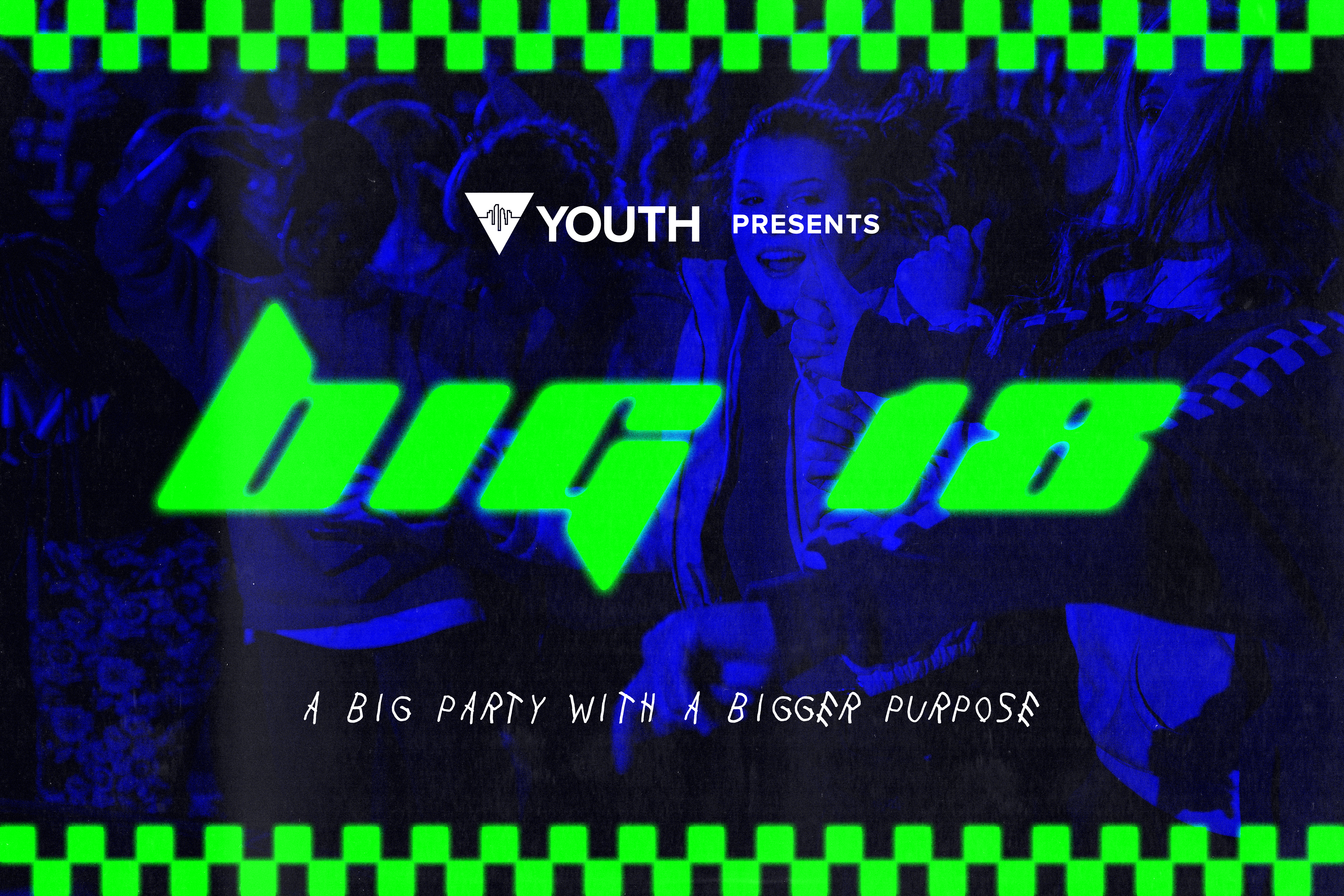
For this project, City First Youth wanted a design for their back to school outreach event called BIG. To begin this design, I searched through photos from previous years of the event and landed on this high energy and high movement group photo. To make the photo more visually appealing, I made the photo black and white and then overlayed a royal blue to create an interesting backdrop for the rest of the design. With the background out of the way, I created a checkered border for the top and bottom using squares to fill out the design. Next I started to fill in the details from the event and used a futuristic inspired font for the name of the event. I used a lime green color to contrast the royal blue and to further enhance the energy and visual appeal of the design. Next I used a more organic, hand drawn font for the event’s tagline and placed it in white underneath the event name to separate it from it. Then I added the youth department’s logo to provide some more branding. For the next step, I added some outer glow to the checkered border and the event name to give it a neon lighting effect. Finally I added some copy paper texture to make the design feel more “real” and less digital.
