
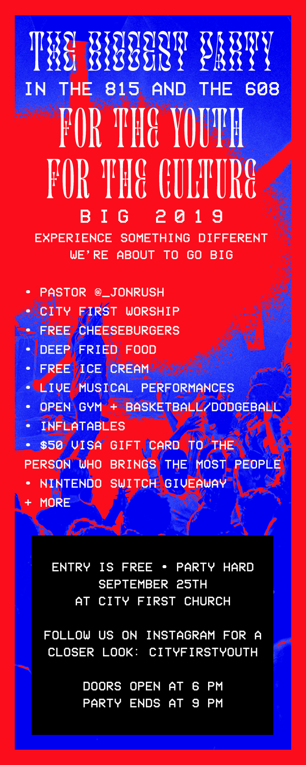
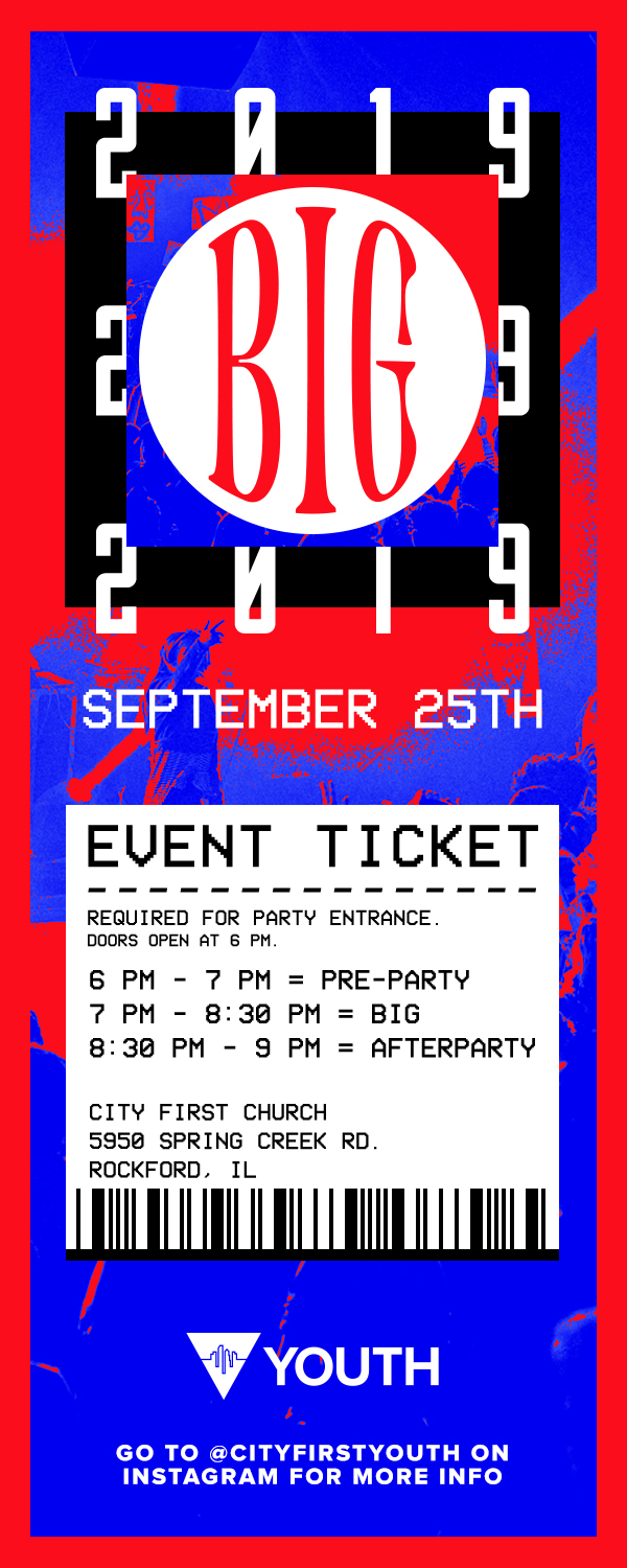
For this project, City First Youth wanted multiple use cases for their upcoming back to school event, BIG. The two use cases above are a promotional poster at the top of the page, and a front and back design for “tickets” used to invite students and display information about the event.
I started the poster design by adding the red and blue background and creating space for the layout from top to bottom. I started by making the name of the event the largest element in the design, and placing the youth department’s logo near it for some immediate brand association. After the logo and name were placed, I began to fill in more of the specifics for the event. To make the information easier to read, I decided to split the details into two columns with the event tagline on the left and more of the selling points on the right. Finally I grounded the date and social media tags in a box box at the bottom of the poster to make it stand out from the rest of the design.
Since the ticket was a much smaller sized design, I wanted to make sure only the most important information was included in the design and that the text wouldn’t be so small that it would be illegible. To solve this problem, I decided to do a front and back design to give me more area to work with. On the front of the ticket I took a similar approach to the poster and made the event name and branding the largest element. I also utilized the ticket style to display some more of the details of the event such as the schedule, date, and time. For the back of the ticket, I again followed my approach with the poster and placed the event tagline at the top and placed the selling points underneath it. Finally, I used a black box contain to some of the information on the front of the ticket once again.
