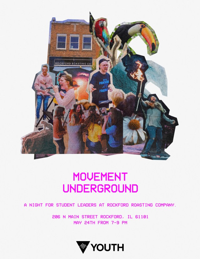
For this digital and print design, City First Youth requested that I use elements from the Powerfest design and re-interpret them for a leader rally following the outreach event. To do this, I utilized the same collage style inspired by cutting out magazine images with safety scissors as a reference to the Powerfest design. In order to add a new twist on the look, I changed the stark black to a clean white for contrast from the original design. In addition I added some grain to the white background to give it some texture. Finally, I used a retro TV font for the text to differentiate it even more from the original design. After giving them multiple color options for the text, pink was what the client chose.