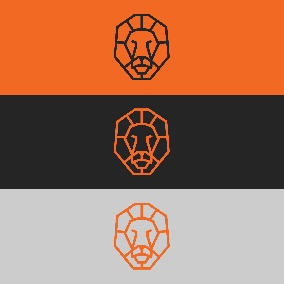
For this project, the client wanted a minimal yet recognizable logo for their photography business. Since many personal photography businesses use letters as the basis for their branding, I wanted to create something in the opposite direction so that it would stand out more in the crowd. With this in mind, I landed on using a lion as the inspiration for the logo.
To begin the process, I found a high resolution, royalty free image of a lion facing the camera head on to correctly reference it’s proportions and anatomy. Given the minimalistic direction the client wanted, I decided to go a little more in the geometric, abstract direction by using as few lines as possible to create the lion’s mane and head. Once I got the lines correct in Illustrator, I added a medium sized stroke to the paths and expanded them so that the width would be preserved. The idea behind the stoke width was that it would be wide enough to retain readability at smaller logo sizes, especially since it would mostly live on business cards that are smaller to begin with.
