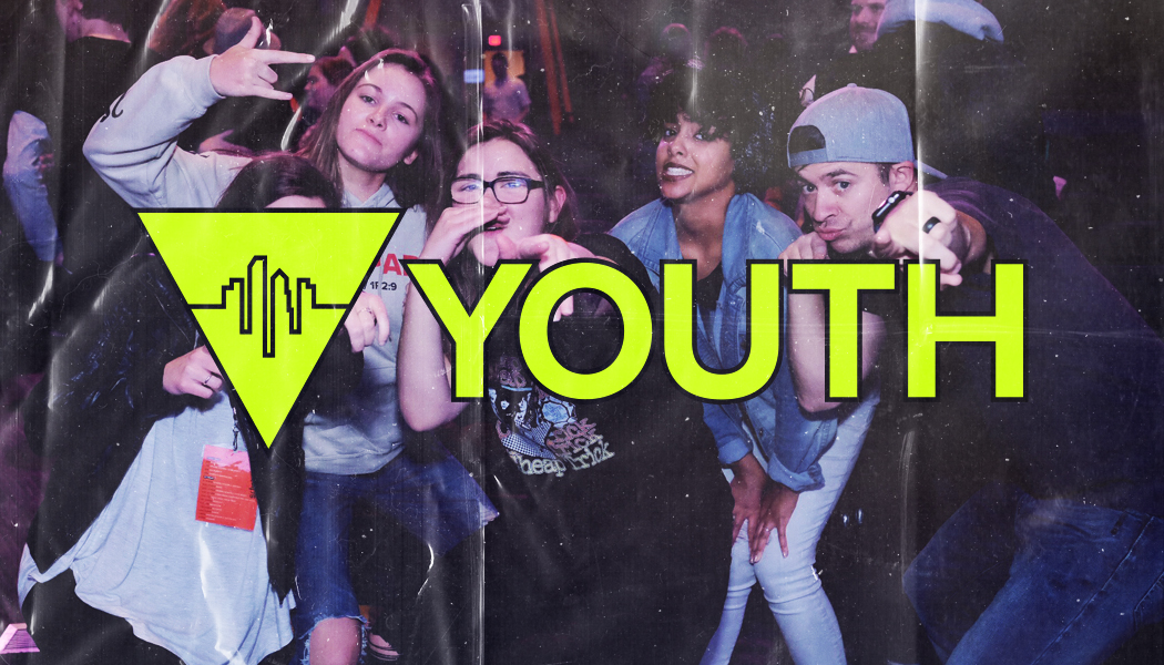
For this project, City First Youth wanted to refresh the front of their business card style invites. To start this design, I used a recent photo from their youth conference and brought it into Lightroom to color correct it. As inspiration for the photo’s color grade, I pulled more of the cooler tones like blue and purple out to give it more of a 90’s flash photography look. After I finished color correcting the photo I brought it into Photoshop and overlayed a magazine paper texture to further enhance the 90’s aesthetic. Finally I brought in the youth department’s logo and made it a neon yellow to contrast the cool tones of the photograph. I also added a subtle black stroke to the logo to increase readability and contrast against the background.
